
Naveena Jewellery
The client approached me with a clear vision: a logo that feels simple yet elegant, built around the initials "NJ" for Naveena Jewellery. Since the logo would be used on a wide range of items—sign boards, jewelry boxes, business cards, purses, and packaging—it needed to be lightweight, scalable, and highly adaptable. After discussing the practical needs and brand tone, we decided on a minimal layout with a refined monogram on top and the brand name placed below. This approach ensures clarity and brand recognition across all mediums without compromising on elegance.
*hey, there's more below if you scroll
ROLE
Brand Identity & Print Designer
DURATION
October - November
ACTUAL TIME TAKEN
Less than a week
TOOLS
Inkscape
Photoshop
Ideations
Client wanted it should feature “NJ” or the full name, but left the exact execution open. Considering its use on everything from sign boards to jewellery boxes and online profiles, I suggested pairing a clean “NJ” monogram icon with a wordmark for maximum flexibility.
We reviewed the examples he provided, I added a few more references, and we quickly aligned on a minimal, refined, and elegant direction. From there, I sketched multiple monogram concepts until we landed on one that captured the brand's tone and could adapt across all mediums.
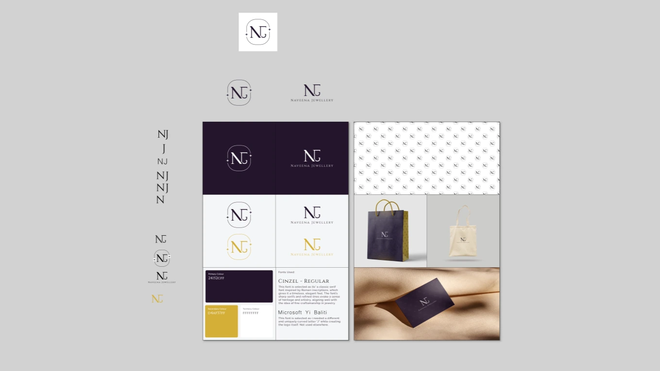
DEEP PLUM
#24152c
ANTIQUE GOLD
#d4af37
White
#fffff
Logo Variations
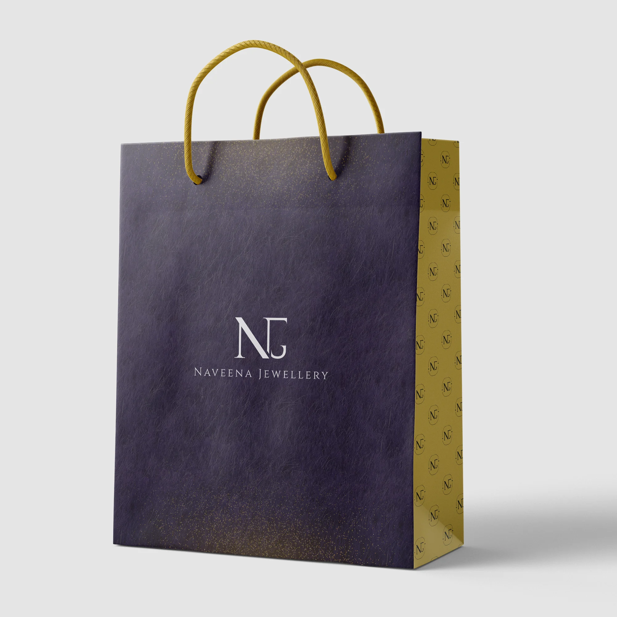
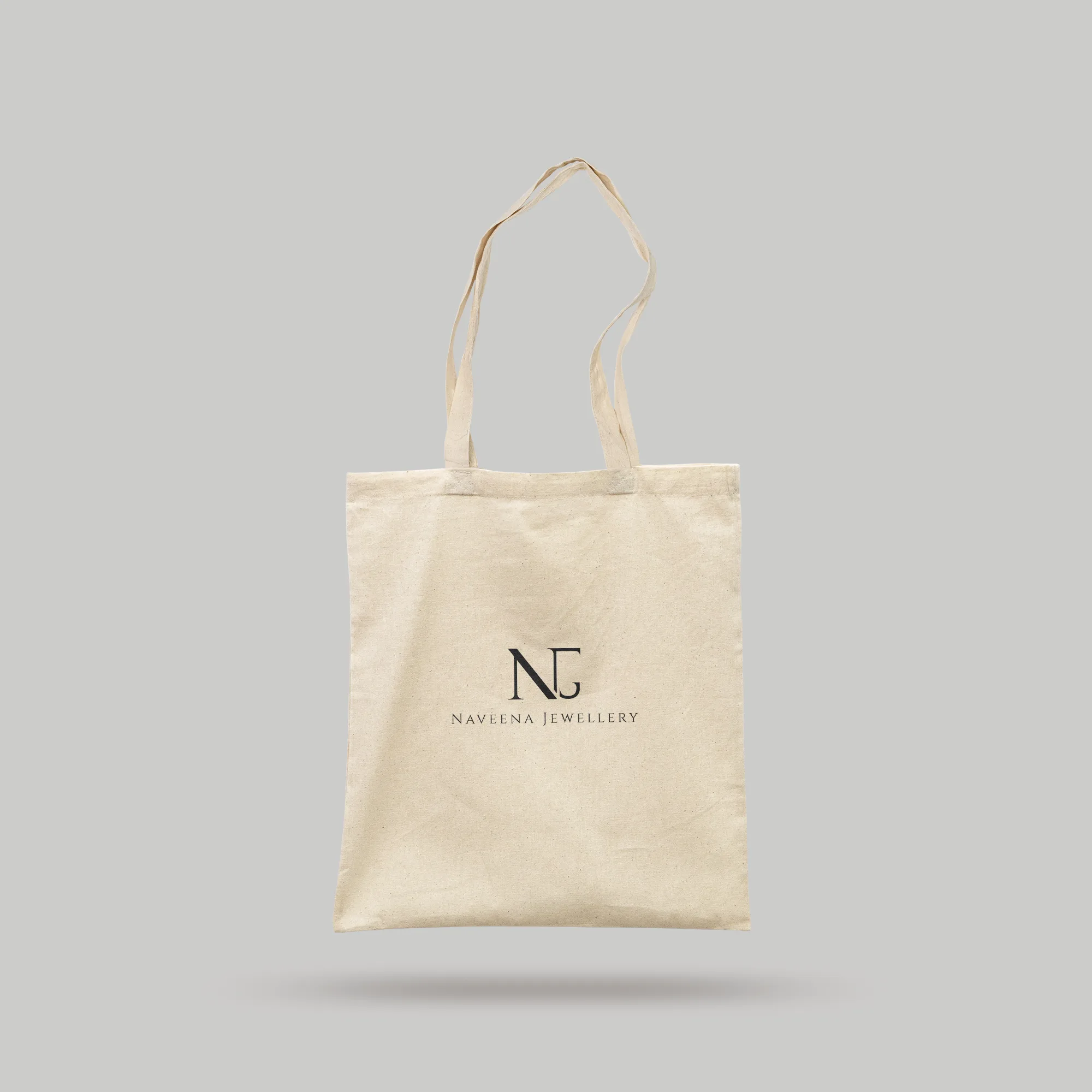
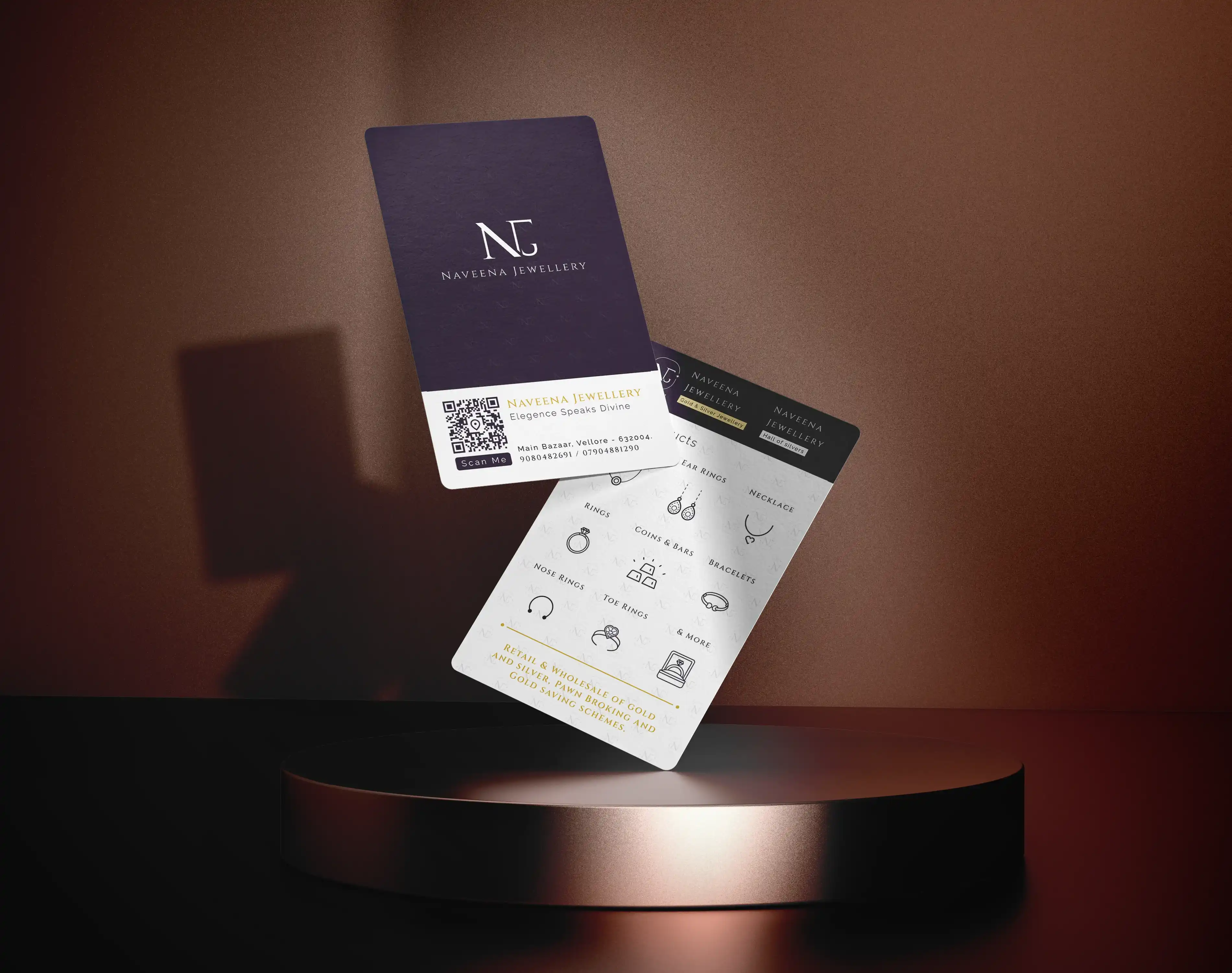
The core design consisted of the “NJ” monogram icon and a wordmark version of the full name, which could be used together or independently depending on the context.To support the brand's luxury feel, I designed a complementary pattern inspired by the logo's curves and lines. This was used across packaging, printed materials, and certain digital applications to create visual consistency.

Mockups
The Playground
a small section of the logo design file
where iam trying to make something
LEARNINGS AND REFLECTION
The smoothness of this project reminded me how much of a difference it makes when the client already knows what they want. As my first fully paid logo project, it was both exciting and a bit of good fortune to have such clear communication from the start. At the same time, it also made me think about how I can recreate that clarity even when clients aren't sure what they want—by asking better questions and adding more discovery steps to my process.
On the design side, I gained valuable experience in building a brand system that works across both traditional and modern mediums. Seeing the logo come to life on everything from jewellery boxes to large shop signage reinforced how important it is to think about scalability and adaptability right from the ideation stage. And above all, this project confirmed that minimal design, when done intentionally, can still feel rich, elegant, and full of character.