Oceanray Private Limited
Oceanray is a company with plans to grow across different industries. When I took on this project, it had one engineering services company under it, with more to follow. The name reflects a vision of reaching beyond oceans and shining like a ray of light across all continents.
This logo needed to reflect that vision while staying adaptable for future sub-brands. My goal was to design something that felt strong, clean, and flexible—a mark that could scale with the brand. In this case study, I'll walk you through how I approached that, what I explored, and how we landed on a direction that balances identity with long-term usability.
*hey, there's more below if you scroll
ROLE
Brand Identity Designer
DURATION
Feb-Mar 2025
ACTUAL TIME TAKEN
Less than a week
TOOLS
Inkscape
Photoshop
Ideations
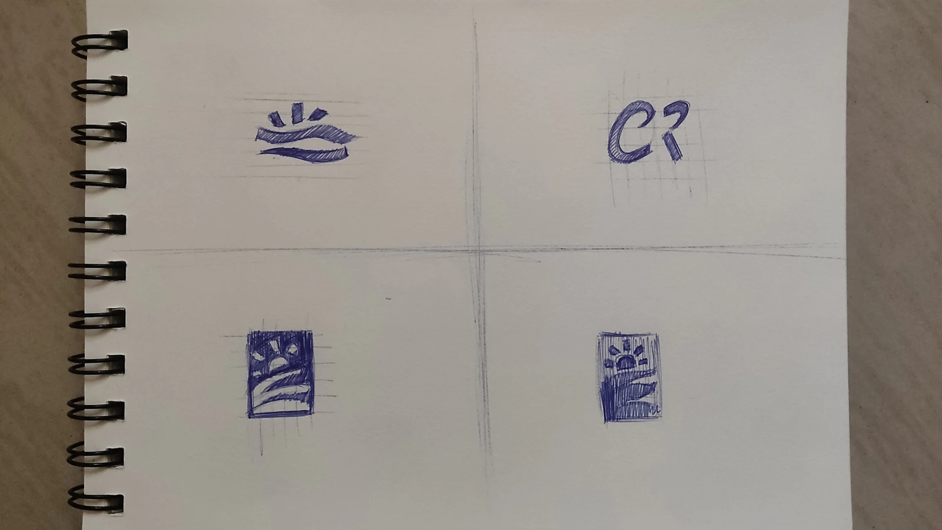
The exploration began with quick sketches to translate Oceanray's vision into visual form. The goal was to capture the ideas of light, motion, and global reach through simple, adaptable marks. These initial thumbnails focused on wave forms, rays, and modular shapes that could evolve with future sub-brands—laying the groundwork for a scalable identity system

CHARCOAL
#2c3e50
LIGHT SKY BLUE
#a1cff3
PLATINUM
#eaeaea
JET
#2a2a2A
HUNYADI YELLOW
#eca72c
Logo Variations
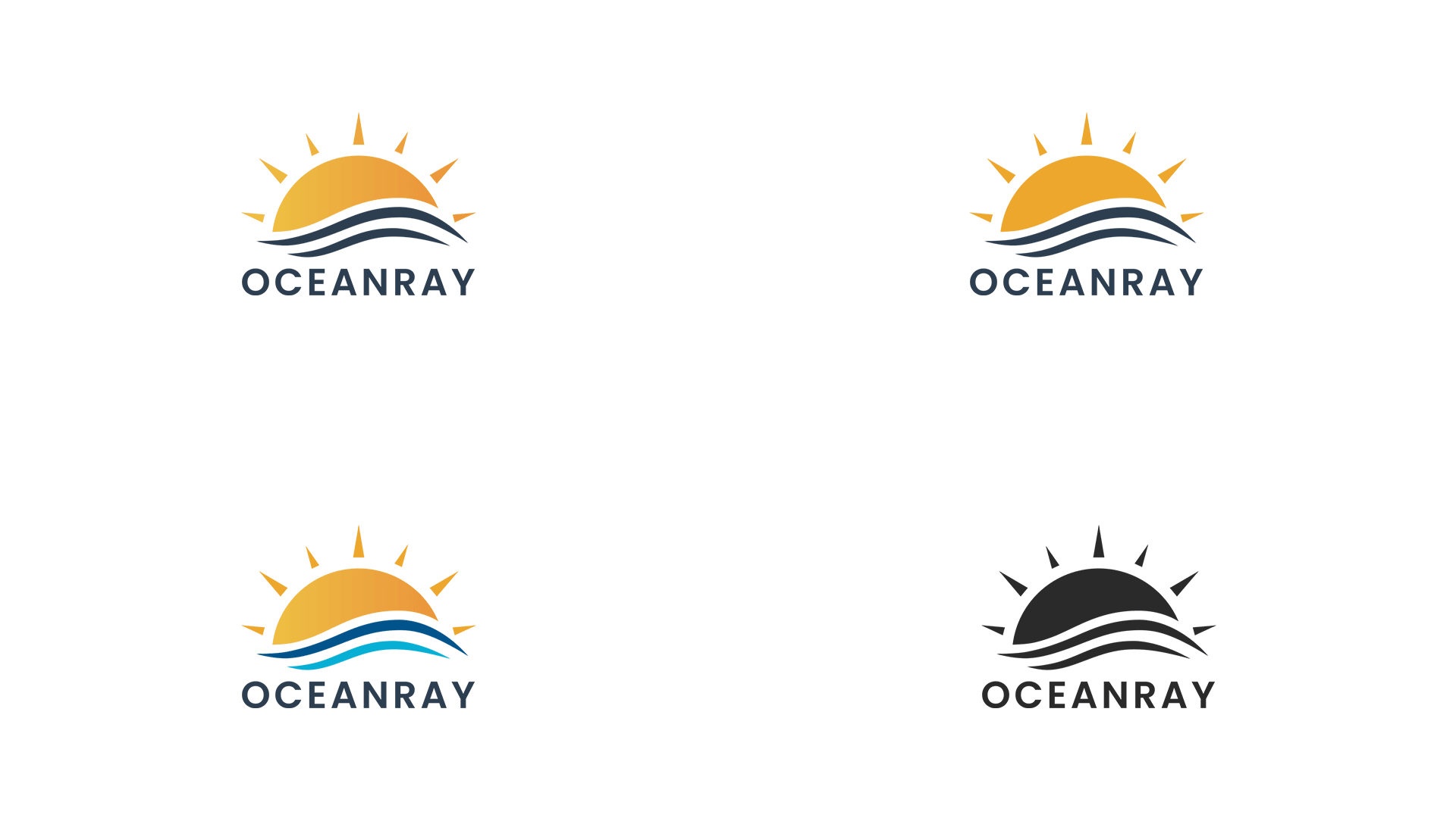
To ensure versatility across different mediums and backgrounds, I developed multiple logo variants—including full-color, flat, monochrome, and dark-mode options. Each version maintains the core identity while adapting for practical use in print, digital, and branded materials.

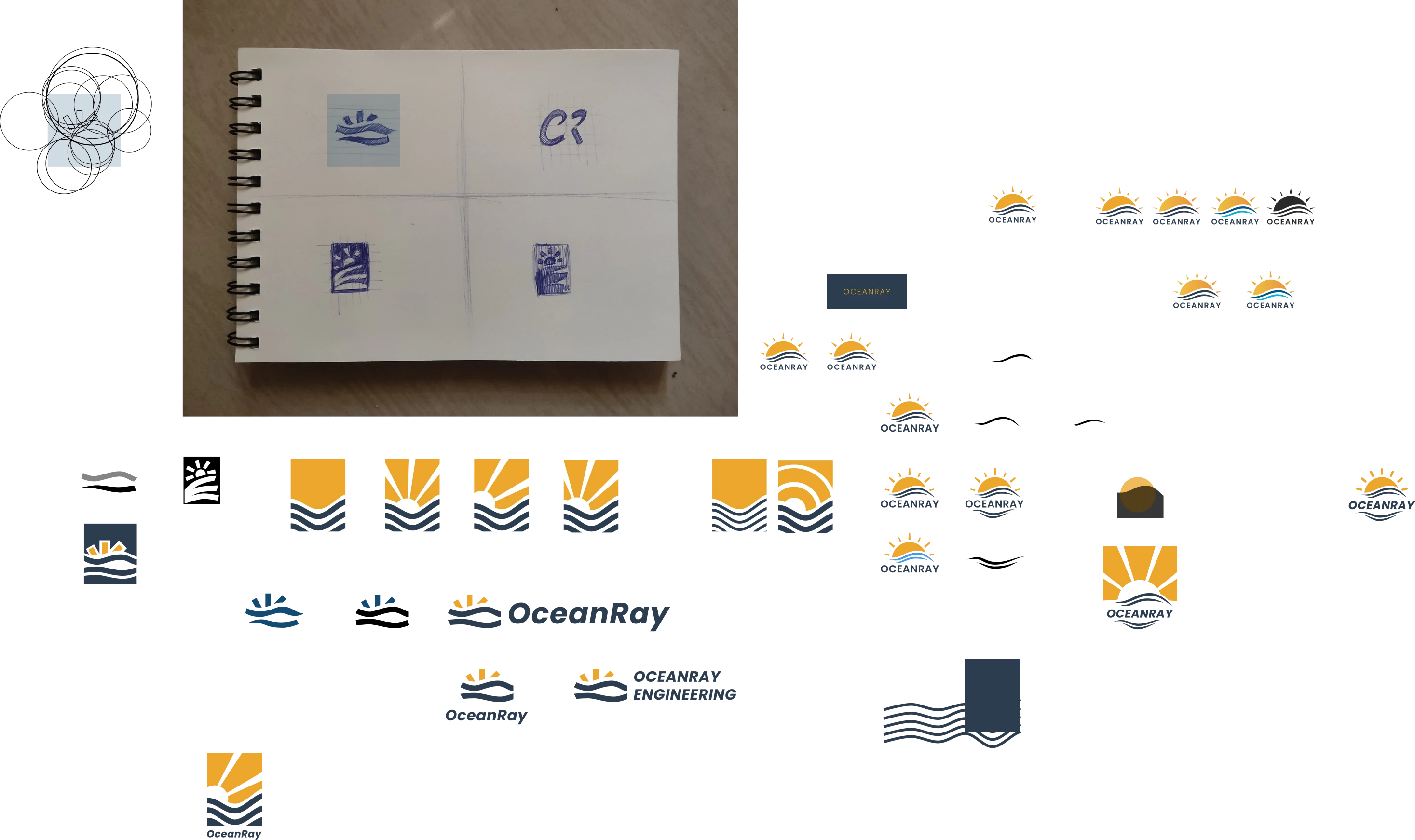
The Playground
a small section of the logo design file
where iam trying to make something

LEARNINGS AND REFLECTION
When I first took on the Oceanray logo project, I had a clear initial direction based on the name and the client's straightforward requirements. As with most of my branding projects, I began with a brief call to understand the company better. That conversation revealed something important: the logo wasn't just for one company, but needed to be flexible enough to represent future companies that would fall under the Oceanray umbrella
With that in mind, I created a mood board and presented a few reference logos to ensure we were aligned visually. This step was helpful in setting expectations—but it also highlighted a key learning moment for me.
My first logo concept was clean and minimal, but the client found it too simple. I then explored a more expressive design, inspired directly by the mood board direction. I personally felt this version was stronger and more distinct—it's included in the logo exploration file shared earlier.
However, the client ultimately preferred a logo closer to the initial vision we discussed—a more universally appealing and adaptable design. So I moved forward with a more generic but functional logo, which was well received.
The biggest takeaway from this project was the importance of clearer communication and tighter alignment upfront. While exploration is vital, setting firmer expectations early could have helped avoid unnecessary revisions and led to a faster, more focused design process. Going forward, I plan to be even more intentional in linking the design process to the client's goals while maintaining creative clarity.