UI / UX Case Study
Salesman
Tracker
IPerform
A mobile-first application designed to help field sales representatives manage their trips, visits, orders, and performance — all from one place.
Role
UI/UX Designer
Platform
Mobile iOS & Android
Year
2023
Status
Design Complete
01 — Overview
What is the app about?
The Brief
Design a mobile application for field sales representatives who visit multiple retail outlets each day — managing trips, logging visits, placing orders, and tracking performance — all without paper forms or manual reporting.
My Contribution
End-to-end UX design: user flows, information architecture, component design, and a complete multi-screen prototype — from authentication to performance dashboards.
Core Modules
Scope
20+ screens covering authentication, home dashboard, trip lifecycle, outlet management, order flow, calendar, performance analytics, and profile settings.
02 — Problem
The challenge
on the ground
"Field sales reps were tracking visits on paper, calling in orders over the phone, and reporting performance at the end of the week — with no real-time visibility for anyone."
Sales teams operating across multiple outlets face a fragmented workflow. There was no unified system to start a trip, log customer visits, capture orders, and view performance trends — leading to missed follow-ups, inaccurate data, and low accountability.
The goal was to design a single cohesive mobile experience that fits naturally into a salesman's daily routine — fast to use, intuitive enough to require no training, rich enough for managers to gain real-time insight.
20+
Screens designed across the full user journey
6
Core user flows mapped end-to-end
7
Typography scale levels in the design system
4
Visit purposes: Order, Delivery, Proposal, Asset
03 — User Persona
Designing for Vignesh
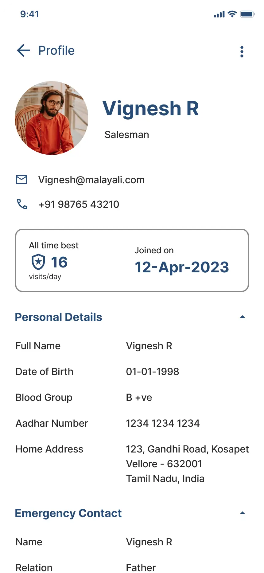
Vignesh R
Field Sales Representative
Location
Vellore, Tamil Nadu
Vehicle
Royal Enfield Thunderbird
Joined
April 2023
Daily Visits
~16 outlets / day
Goals
Pain Points
Context of Use
Uses the app primarily on the go — checking in at outlets, logging orders between stops, and reviewing his daily trip summary at the end of the day. Speed and clarity are critical; complex flows are a dealbreaker.
04 — Key User Flows
How users move
through the app
01
Authentication
A clean login and registration flow to onboard salespeople securely.
02
Trip Lifecycle
The core daily flow — start a trip, visit outlets, log activities, end with a summary.
03
Visit Registration
Log each visit with purpose, respondent details, photo, and follow-up date.
04
Order Taking
Place orders at the outlet — select SKUs, quantities, and delivery dates.
05
Performance Tracking
Visits, orders, and acquisitions over time with weekly and monthly trends.
06
Leave Management
Apply for leave, choose type (Paid / CL / LOP), and view history.
05 — Screen Showcase
Screens & layouts
Each screen was designed around the micro-moment a salesperson faces in the field — optimising for one-handed use, minimal text entry, and fast task completion.
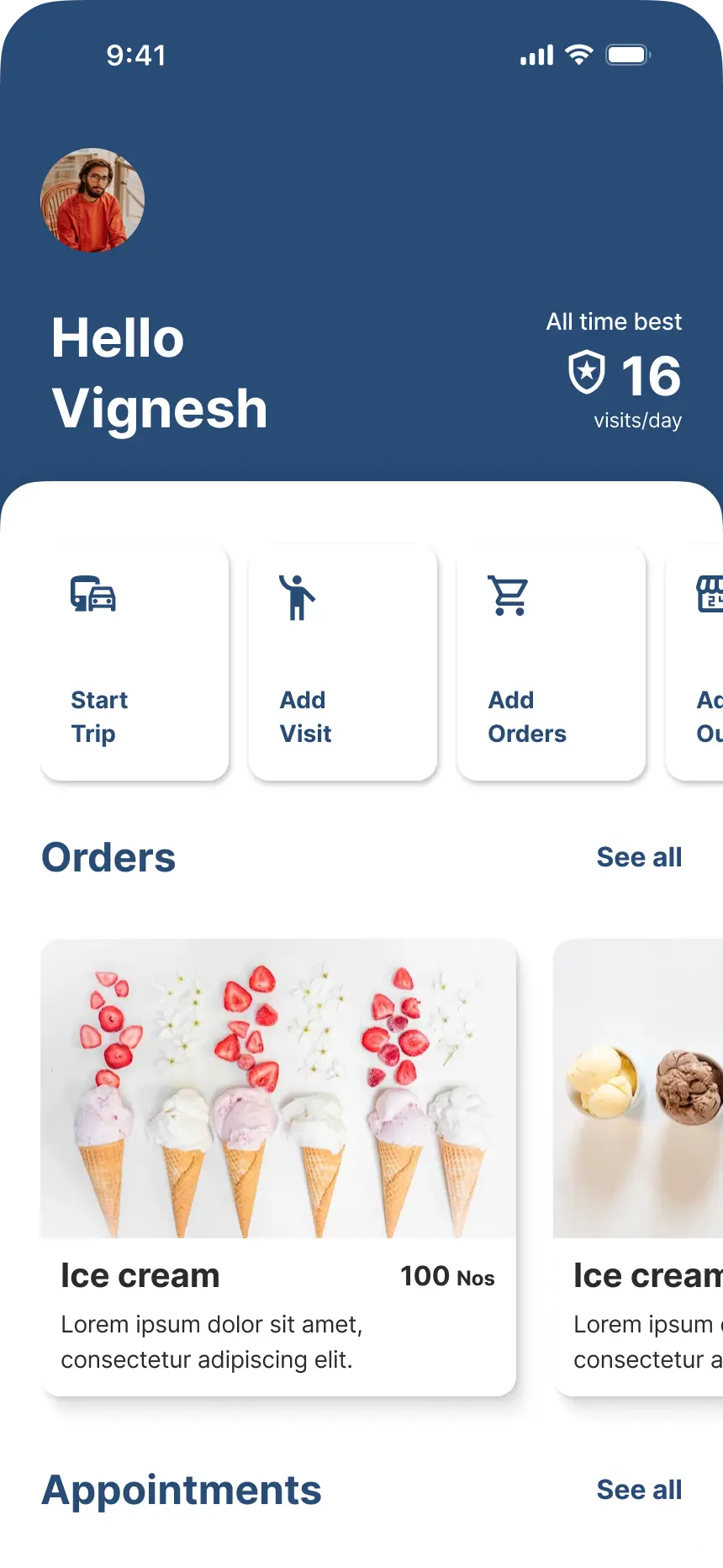
Home Dashboard
Greetings, quick actions, recent orders & appointments
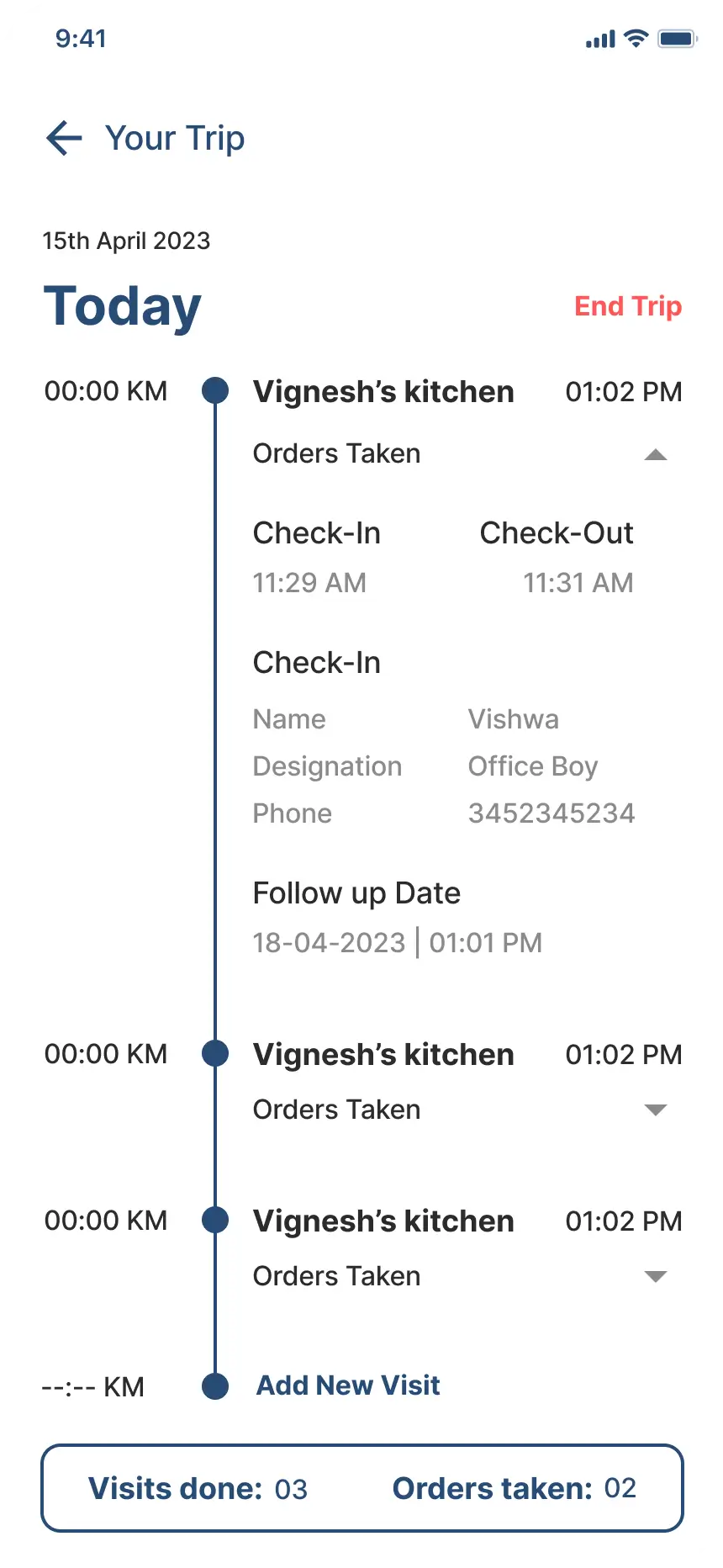
Trip Management
Start/end trip, live timer, KM tracking, outlet visits
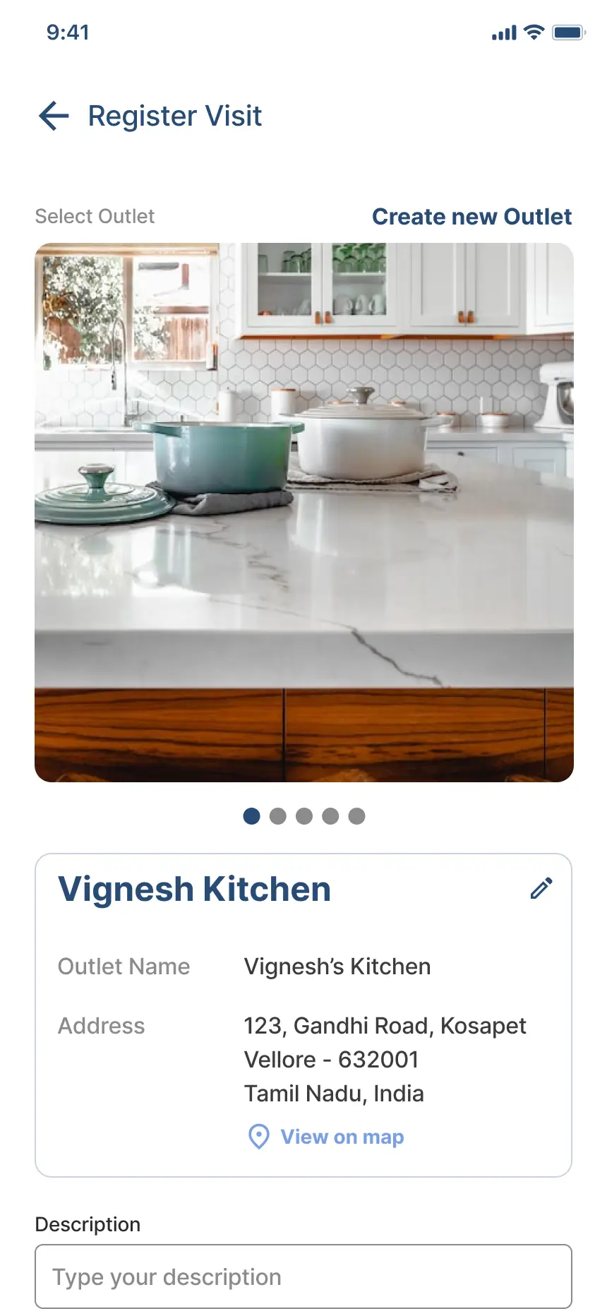
Register Visit
Purpose, respondent info, feedback, photo, follow-up
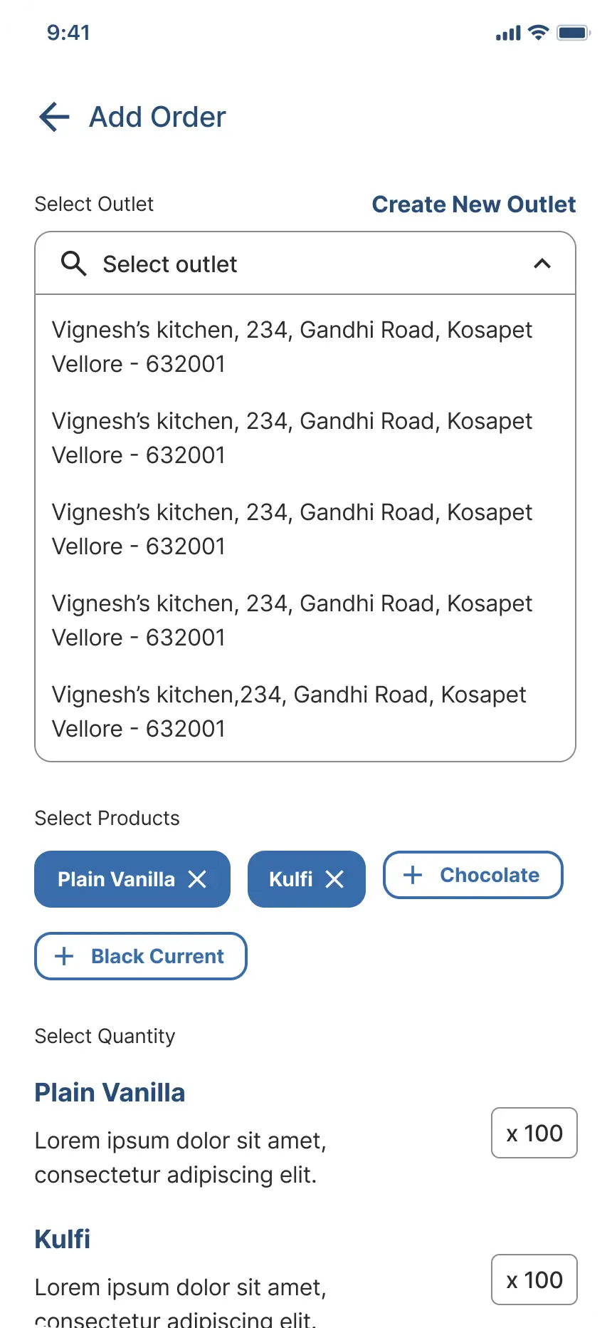
Add Order
View, add, edit, or delete customer orders
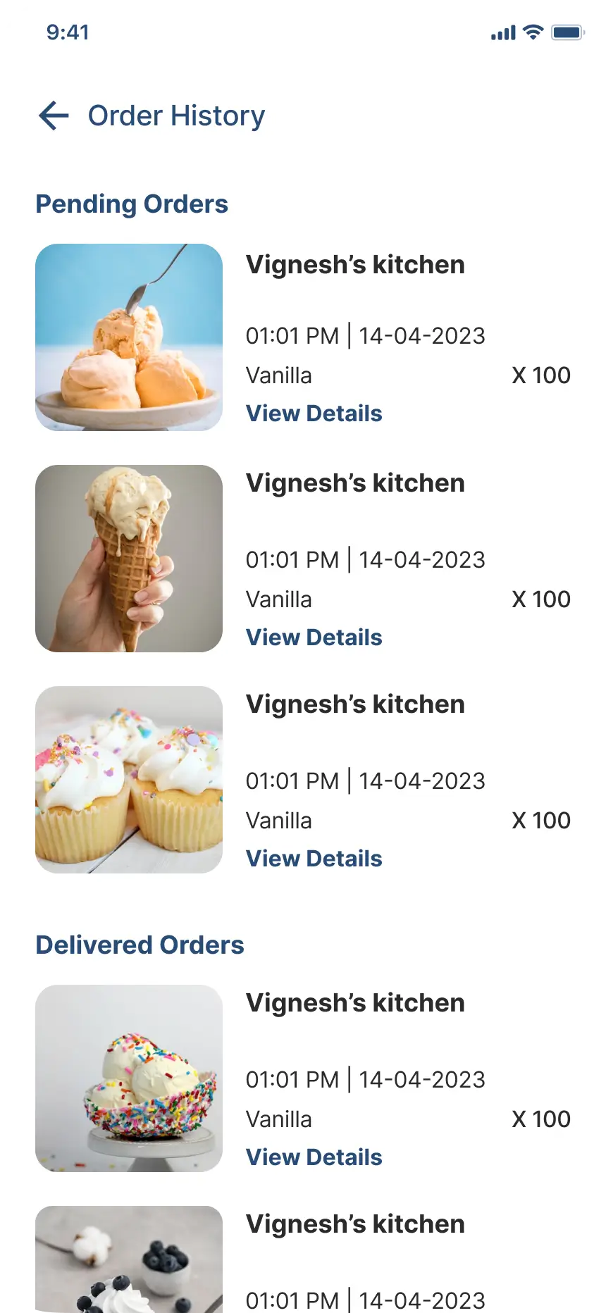
Order Management
Products, quantities, delivery date, order summary
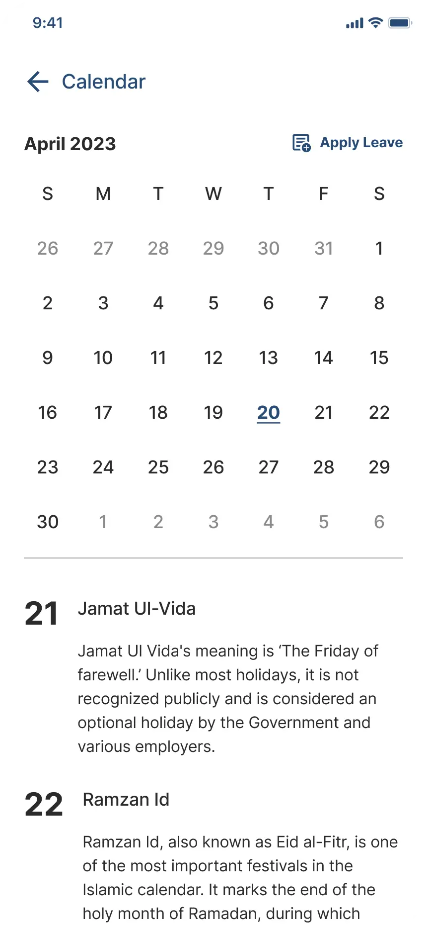
Calendar & Leave
Monthly calendar, apply leave (Paid / CL / LOP)
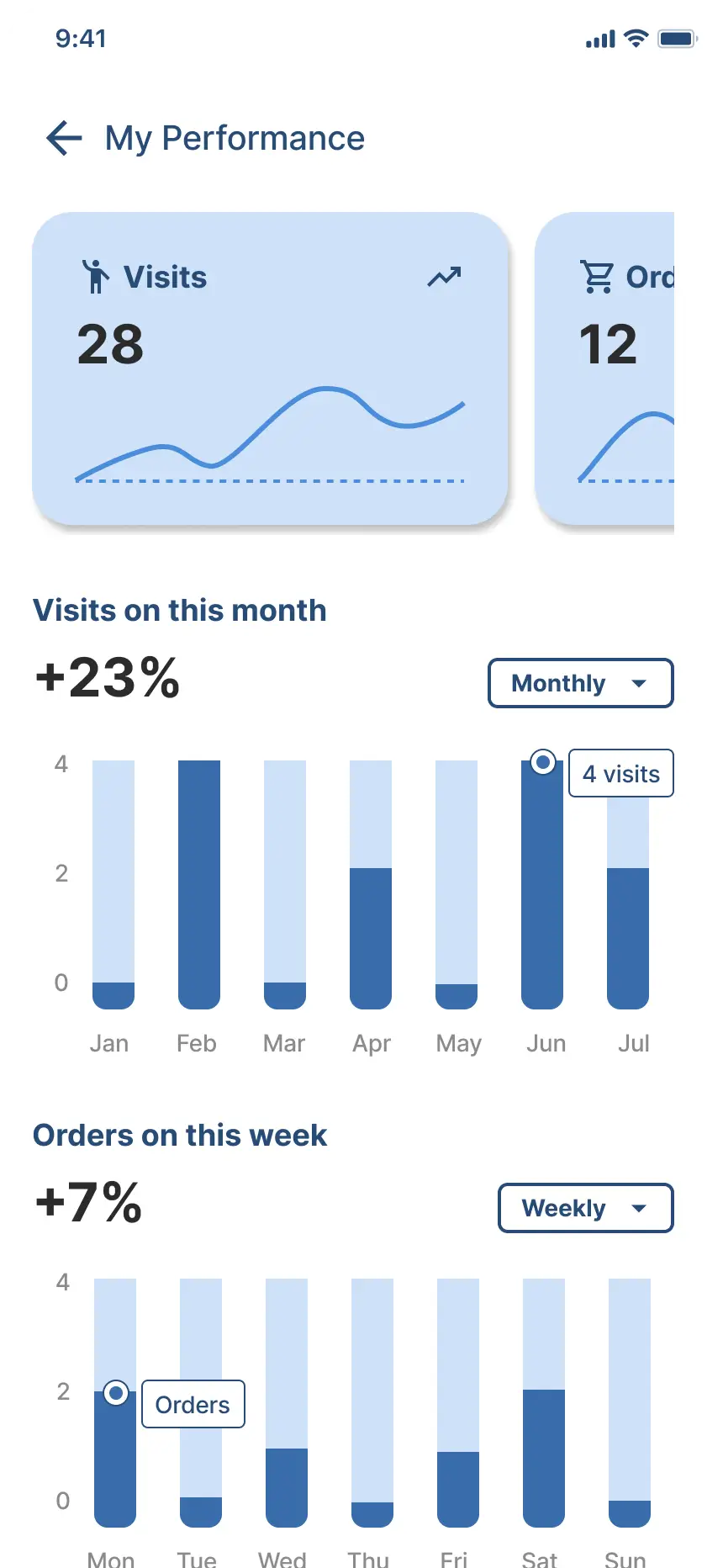
My Performance
Visits, orders, acquisitions — weekly / monthly graphs
Profile
Personal info, vehicle, emergency contacts, settings
06 — Design System
Typography & components
Type Scale
Design Tokens
#ffffffPage background#2B2B2BPrimary text#8B8B8BBody / secondary#C3C3C3Labels / captions#CEE1F8CTAs / highlights#274C77Primary ColourVisit Purpose Types
Leave Types
Future Scope
07 — Reflection
What I learned
01
Designing for the Field
Field users don't have the luxury of time or two hands. Every extra tap is a friction point. This project taught me to ruthlessly simplify flows and think in micro-moments — not screens.
02
Information Hierarchy
With a 7-level type scale and dense data across screens, maintaining clear visual hierarchy required constant discipline and a consistent approach to spacing, weight, and colour.
03
Scope & Prioritisation
The file had annotations on "pending screens" and "future implementations" — a reminder that good design is iterative. Knowing what to leave out of v1 is as important as what goes in.